提问人:Irakli Lekishvili 提问时间:1/15/2012 最后编辑:JKDIrakli Lekishvili 更新时间:12/18/2022 访问量:4241779
如何使用 CSS 将文本垂直居中?[复制]
How do I vertically center text with CSS? [duplicate]
问:
我有一个包含文本的元素,我想将这个垂直中心的内容对齐。<div><div>
这是我的风格:<div>
#box {
  height: 170px;
  width: 270px;
  background: #000;
  font-size: 48px;
  color: #FFF;
  text-align: center;
}
<div id="box">
Lorem ipsum dolor sit
</div>实现这一目标的最佳方法是什么?
答:
3299赞
14 revs, 7 users 76%Michiel van Oosterhout
#1
您可以尝试以下基本方法:
div {
  height: 100px;
  line-height: 100px;
  text-align: center;
  border: 2px dashed #f69c55;
}
<div>
Hello World!
</div>不过,它只适用于单行文本,因为我们将行的高度设置为与包含框元素相同的高度。
更通用的方法
这是垂直对齐文本的另一种方法。此解决方案适用于单行和多行文本,但仍需要固定高度的容器:
div {
  height: 100px;
  line-height: 100px;
  text-align: center;
  border: 2px dashed #f69c55;
}
span {
  display: inline-block;
  vertical-align: middle;
  line-height: normal;
}
<div>
<span>Hello World!</span>
</div>CSS 只是将 的大小调整为 ,垂直居中对齐 ,将 的行高设置为等于其高度,并使 成为带有 的内联块。然后,它将 的行高设置回正常值,因此其内容将在块内自然流动。<div><span><div><span>vertical-align: middle<span>
模拟表格显示
这是另一个选项,它可能不适用于不支持 display: table 和 display: table-cell(基本上只是 Internet Explorer 7)的旧浏览器。使用 CSS,我们模拟表格行为(因为表格支持垂直对齐),HTML 与第二个示例相同:
div {
  display: table;
  height: 100px;
  width: 100%;
  text-align: center;
  border: 2px dashed #f69c55;
}
span {
  display: table-cell;
  vertical-align: middle;
}
<div>
<span>Hello World!</span>
</div>使用绝对定位
该技术使用绝对定位的元素,将顶部、底部、左侧和右侧设置为 0。在 Smashing Magazine 的一篇文章《CSS 中的绝对水平和垂直居中》中对此进行了更详细的描述。
div {
  display: flex;
  justify-content: center;
  align-items: center;
  height: 100px;
  width: 100%;
  border: 2px dashed #f69c55;
}
<div>
<span>Hello World!</span>
</div>评论
61赞
Rob
1/15/2012
因为如果 div 或文本更改或添加更多内容,就会出错。
12赞
rmorse
9/12/2012
但这就是他所说的,如果你知道你会使用多少文本,它是完全可以接受的......然而,下面的解决方案更加灵活
0赞
Augusto
6/3/2021
第一个选项中可能还需要“padding:0”
0赞
Amrit Bera
4/24/2022
但是我只想将文本垂直居中而不是水平居中,那么解决方案是什么??
0赞
NuclearPeon
8/12/2022
对于我尝试的基本方法,当我处于一个值时,我无法取得结果,所以我使用了并且奏效了。height%em
153赞
Ariful Islam
1/15/2012
#2
您可以通过添加以下 CSS 代码轻松做到这一点:
display: table-cell;
vertical-align: middle;
这意味着你的CSS最终看起来像:
#box {
  height: 90px;
  width: 270px;
  background: #000;
  font-size: 48px;
  font-style: oblique;
  color: #FFF;
  text-align: center;
  margin-top: 20px;
  margin-left: 5px;
  display: table-cell;
  vertical-align: middle;
}
<div id="box">
Some text
</div>评论
9赞
Tim
1/15/2012
不过,看起来这扼杀了边距属性。
0赞
Jürgen Steinblock
1/25/2022
如果我将父 div 设置为 .谢谢display: flex; justify-content: center; align-items: center;
0赞
softmarshmallow
3/28/2022
在Chrome上不起作用..?
0赞
Tony
12/5/2022
在Firefox上也不起作用
5赞
user
2/2/2014
#3
对于单行文本(或单个字符),可以使用以下技术:
当具有非固定的相对高度(以 % 为单位)时,可以使用它。#box
<div id="box"></div>
#box::before {
    display: block;
    content: "";
    height: 50%;
}

#box::after {
    vertical-align: top;
    line-height: 0;
    content: "TextContent";
}
在 JsBin(更易于编辑 CSS)或 JsFiddle(更易于更改结果帧高度)上观看现场演示。
如果你想把内部文本放在HTML中,而不是CSS中,那么你需要将文本内容包装在额外的内联元素中,并进行编辑以匹配它。(当然,应该删除属性。#box::aftercontent:
例如。
在这种情况下,应替换为 .<div id="box"><span>TextContent</span></div>#box::after#box span
要获得 Internet Explorer 8 支持,必须替换为 .:::
评论
0赞
Lucio Mollinedo
6/4/2016
在这里描述的所有方法中,你是唯一能施展魔法的方法。我的情况:一个 div 有一个 span 元素,带有使用 css 的旋转时钟图标(用于加载层)。我刚刚删除了 #box::after 的“TextContent”(将属性保留为空字符串),仅此而已。
1588赞
Danield
3/6/2014
#4
另一种方式(此处尚未提及)是使用 Flexbox。
只需将以下代码添加到容器元素中:
display: flex;
justify-content: center; /* Align horizontal */
align-items: center; /* Align vertical */
Flexbox 演示 1
.box {
  height: 150px;
  width: 400px;
  background: #000;
  font-size: 24px;
  font-style: oblique;
  color: #FFF;
  text-align: center;
  padding: 0 20px;
  margin: 20px;
  display: flex;
  justify-content: center;
  /* align horizontal */
  align-items: center;
  /* align vertical */
}
<div class="box">
Lorem ipsum dolor sit amet, consectetuer adipiscing elit, sed diam nonummy nibh
</div>或者,当 flex 容器中只有一个 flex-item 时,flexbox 也可以使用自动边距居中 flex 项目,而不是通过容器对齐内容(如上面问题中给出的示例)。
因此,要使柔性项目在水平和垂直方向上居中,只需将其设置为margin:auto
Flexbox 演示 2
.box {
  height: 150px;
  width: 400px;
  background: #000;
  font-size: 24px;
  font-style: oblique;
  color: #FFF;
  text-align: center;
  padding: 0 20px;
  margin: 20px;
  display: flex;
}
.box span {
  margin: auto;
}
<div class="box">
<span>margin:auto on a flex item centers it both horizontally and vertically</span>
</div>铌:以上所有内容都适用于在水平行中布置项目时居中项目。这也是默认行为,因为默认情况下,的值为 。但是,如果 flex-items 需要布置在垂直列中,则应在容器上设置以将主轴设置为列,此外,和属性现在以相反的方式工作,垂直居中和水平居中)flex-directionrowflex-direction: columnjustify-contentalign-itemsjustify-content: centeralign-items: center
flex-direction: 色谱柱演示
.box {
  height: 150px;
  width: 400px;
  background: #000;
  font-size: 18px;
  font-style: oblique;
  color: #FFF;
  display: flex;
  flex-direction: column;
  justify-content: center;
  /* vertically aligns items */
  align-items: center;
  /* horizontally aligns items */
}
p {
  margin: 5px;
  }
<div class="box">
<p>
When flex-direction is column...
</p>
<p>
"justify-content: center" - vertically aligns
</p>
<p>
"align-items: center" - horizontally aligns
</p>
</div>从 Flexbox 开始查看它的一些功能并获得最大浏览器支持的语法的一个好地方是 flexyboxes
此外,现在的浏览器支持非常好:caniuse
为了实现 和 的跨浏览器兼容性,可以使用以下命令:display: flexalign-items
display: -webkit-box;
display: -webkit-flex;
display: -moz-box;
display: -ms-flexbox;
display: flex;
-webkit-flex-align: center;
-ms-flex-align: center;
-webkit-align-items: center;
align-items: center;
评论
47赞
user
3/8/2014
Flexbox 支持表
3赞
kintsukuroi
12/11/2021
当某些文本为 1 行而其他文本为 2 行时,或者当您具有不同的高度元素时,这非常有效。对我来说最好的答案。
0赞
Slion
7/19/2022
必须使用该解决方案,它也适用于内部文本。虽然不得不加上height: 100%;
0赞
Nianyi Wang
11/4/2022
我有点担心过度使用 flexbox 会导致性能问题。会吗?
0赞
JackElia
11/6/2022
这对我很有帮助,因为当我像其他解决方案一样使用行高时,它在IOS上不起作用。
5赞
bortunac
3/7/2014
#5
简单而通用的方式是(如 Michielvoo 的 表格方法):
[ctrv]{
    display: table !important;
}

[ctrv] > *{ /* Addressing direct descendants */
      display: table-cell;
      vertical-align: middle;
      // text-align: center; /* Optional */
}
在父标记上使用此属性(或等效类)甚至可以使许多子标记对齐:
<parent ctrv> <ch1/> <ch2/> </parent>
73赞
ankitd
8/11/2014
#6
所有功劳都归功于 Ekström Link @Sebastian此链接所有者;请仔细阅读。在行动中看到它 codepen.通过阅读上面的文章,我还创建了一个演示小提琴。
只需三行 CSS(不包括供应商前缀),我们就可以借助转换来完成:translateY 垂直居中我们想要的任何内容,即使我们不知道它的高度。
CSS 属性转换通常用于旋转和缩放元素,但通过其 translateY 函数,我们现在可以垂直对齐元素。通常,这必须通过绝对定位或设置行高来完成,但这些要求您知道元素的高度或仅适用于单行文本等。
因此,为此,我们编写:
.element {
    position: relative;
    top: 50%;
    transform: translateY(-50%);
}
这就是您所需要的。它是一种类似于绝对位置方法的技术,但好处是我们不必在元素上设置任何高度,也不必在父元素上设置位置属性。它开箱即用,即使在 Internet Explorer 9 中也是如此!
为了让它更简单,我们可以将其编写为带有其供应商前缀的 mixin。
评论
0赞
Kodali444
7/14/2021
即使对于文本和图像组合,这也适用于我
26赞
Jürg
8/28/2014
#7
灵活的方法
div {
  width: 250px;
  min-height: 50px;
  line-height: 50px;
  text-align: center;
  border: 1px solid #123456;
  margin-bottom: 5px;
}
span {
  display: inline-block;
  vertical-align: middle;
  line-height: normal;
}
<div>
<span>Lorem ipsum dolor sit amet, consectetur adipiscing elit.<br />
Lorem ipsum dolor sit amet, consectetur adipiscing elit.<br />
Lorem ipsum dolor sit amet, consectetur adipiscing elit.</span>
</div>
<div>
<span>Lorem ipsum dolor sit amet, consectetur adipiscing elit.</span>
</div>
<div>
<span>Lorem ipsum dolor sit amet.</span>
</div>
<div>
-3赞
Sam Alexander
9/2/2014
#8
一个更好、更简单、响应迅速的方法是在 CSS 中设置为大约 45%:margin-top
margin-top: 45%;
您可能需要使用该数字,但它将位于周围 div 的中心。
评论
6赞
katzenhut
2/1/2016
这根本没有响应。它也没有更好,尽管可能更容易。此方法将仅将文本居中置于元素的特定字体大小和高度。改变任何一个,你必须摆弄神奇的数字。
0赞
jak.b
9/29/2018
一个非常不准确的方法......相反,您可以使用 CSS3 calc() 函数: .但是有很多解决方案!margin-top: calc(50% - [height of element]);
12赞
Eseirt
9/29/2014
#9
另一种方式:
不要设置 的属性,而是使用 来实现效果。与行高类似,它仅在您有一行文本时才有效。虽然这样,如果你有更多的内容,文本仍然会居中,但div本身会稍微大一些。heightdivpadding:
因此,与其选择:
div {
  height: 120px;
  line-height: 120px;
}
你可以说:
div {
   padding: 60px 0; /* Maybe 60 minus font-size divided by two, if you want to be exact */
}
这会将 to 的顶部和底部设置为零,将 left 和 right 设置为零,使 120 像素(加上字体的高度)变高,并将文本垂直居中放置在 div 中。paddingdiv60pxpaddingdiv
132赞
BAR
10/26/2014
#10
供参考并添加更简单的答案:
纯 CSS:
.vertical-align {
    position: relative;
    top: 50%;
    -webkit-transform: translateY(-50%);
    -ms-transform: translateY(-50%);
    transform: translateY(-50%);
}
或作为 SASS/SCSS Mixin:
@mixin vertical-align {
    position: relative;
    top: 50%;
    -webkit-transform: translateY(-50%);
    -ms-transform: translateY(-50%);
    transform: translateY(-50%);
}
使用者:
.class-to-center {
    @include vertical-align;
}
作者:Sebastian Ekström 的博客文章 Vertical align anything with just 3 lines of CSS:
由于元素被放置在“半像素”上,这种方法可能会导致元素模糊。对此的解决方案是将其父元素设置为 preserve-3d。如下所示:
.parent-element {
    -webkit-transform-style: preserve-3d;
    -moz-transform-style: preserve-3d;
    transform-style: preserve-3d;
}
我们生活在 2015+ 年,每个主要的现代浏览器都支持 Flex Box。
从现在开始,这将是网站的制作方式。
学习它!
评论
0赞
Justin
5/23/2022
在别人不工作的时候工作
2赞
Dave
10/30/2014
#11
我需要一排可点击的大象,垂直居中,但不使用表格来绕过 Internet Explorer 9 的一些怪异之处。
我最终找到了最好的 CSS(满足我的需求),它非常适合 Firefox、Chrome 和 Internet Explorer 11。可悲的是,Internet Explorer 9 仍然在嘲笑我......
div {
  border: 1px dotted blue;
  display: inline;
  line-height: 100px;
  height: 100px;
}

span {
  border: 1px solid red;
  display: inline-block;
  line-height: normal;
  vertical-align: middle;
}

.out {
  border: 3px solid silver;
  display: inline-block;
}
<div class="out" onclick="alert(1)">
<div> <span><img src="http://www.birdfolk.co.uk/littleredsolo.png"/></span> </div>
<div> <span>A lovely clickable option.</span> </div>
</div>
<div class="out" onclick="alert(2)">
<div> <span><img src="http://www.birdfolk.co.uk/bang2/Ship01.png"/></span> </div>
<div> <span>Something charming to click on.</span> </div>
</div>显然,您不需要边框,但它们可以帮助您了解它是如何工作的。
3赞
mPrinC
2/22/2015
#12
我只想扩展 Michielvoo 的答案,以释放对 div 高度的行高和呼吸的需求。它基本上只是一个简化版本,如下所示:
div {
  width: 250px;
  /* height: 100px;
  line-height: 100px; */
  text-align: center;
  border: 1px solid #123456;
  background-color: #bbbbff;
  padding: 10px;
  margin: 10px;
}

span {
  display: inline-block;
  vertical-align: middle;
  line-height: normal;
}
<div>
<span>All grown-ups were once children... but only few of them remember it</span>
</div>
<div>
<span>And now here is my secret, a very simple secret: It is only with the heart that one can see rightly; what is essential is invisible to the eye.</span>
</div>注意:注释掉的一部分是封闭 .cssfixed-heightdiv
0赞
Rahul
3/15/2015
#13
.element{position: relative;top: 50%;transform: translateY(-50%);}
将此小代码添加到元素的 CSS 属性中。这真是太棒了。试试吧!
20赞
Pranav Singh
6/29/2015
#14
被接受为答案的解决方案非常适合使用与 div 的高度相同的解决方案,但是当文本换行 OR 分成两行时,此解决方案并不完美。line-height
如果文本换行或位于 div 内的多行上,请尝试此方法。
#box
{
  display: table-cell;
  vertical-align: middle;
}
有关更多参考,请参阅:
0赞
bruceceng
9/19/2015
#15
较新的浏览器现在支持 CSS 功能。如果你的目标是这些浏览器,你可能想考虑做这样的事情:calc
<div style="position: relative; width: 400px; height: 400px; background-color: red">
  <span style="position: absolute; line-height: 40px; height: 80px; text-align: center; width: 300px; overflow: hidden; top: calc(50% - 40px); left: calc(50% - 150px);">
    Here are two lines that will be centered even if the parent div changes size.
  </span>
</div>
关键是在绝对或相对定位的父 div 内部使用。style = "top: calc(50% - [innerFixedHeightInPX/2]px); height: [innerFixedHeightInPX]px;"
5赞
Peter Girnus
10/28/2015
#16
满足您所有的垂直对齐需求!
声明这个 Mixin:
@mixin vertical-align($position: relative) {
  position: $position;
  top: 50%;
  -webkit-transform: translateY(-50%);
  -ms-transform: translateY(-50%);
  transform: translateY(-50%);
}
然后将其包含在您的元素中:
.element{
    @include vertical-align();
}
评论
2赞
Tonatio
9/11/2016
效果很好。只是对一些读者的评论:这段代码是 Sass。
15赞
Marco Allori
12/2/2015
#17
请尝试以下解决方案:
.EXTENDER {
    position: absolute;
    top: 0px;
    left: 0px;
    bottom: 0px;
    right: 0px;
    width: 100%;
    height: 100%;
    overflow-y: hidden;
    overflow-x: hidden;
}

.PADDER-CENTER {
    width: 100%;
    height: 100%;
    display: -webkit-box;
    display: -moz-box;
    display: -ms-flexbox;
    display: -webkit-flex;
    display: flex;
    -webkit-box-pack: center;
    -moz-box-pack: center;
    -ms-flex-pack: center;
    -webkit-justify-content: center;
    justify-content: center;
    -webkit-box-align: center;
    -moz-box-align: center;
    -ms-flex-align: center;
    -webkit-align-items: center;
    align-items: center;
}
<div class="EXTENDER">
<div class="PADDER-CENTER">
<div contentEditable="true">Edit this text...</div>
</div>
</div>使用 CSS+ 构建。
评论
0赞
Peter Mortensen
12/9/2022
当前的语法荧光笔很奇怪。查看“-ms-flex-pack”、“-webkit-justify-content”、“-ms-flex-align”和“-webkit-align-items”。这可能也是不正确的:“-webkit-box-pack”、“-moz-box-pack”、“-webkit-box-align”和“-moz-box-align”。
13赞
satwik
4/15/2016
#18
您还可以使用以下属性。
display: flex;
align-content: center;
justify-content : center;
评论
0赞
Masa S-AiYa
6/12/2016
谢谢“satwik boorgula”,我不认为你的代码有问题,也许我的代码中有一些冲突。我用以下代码进行测试:<div id=“topper” class=“container”> <span>Your Content!</span> </div> 但它可以通过使用上面提到的“michielvoo”代码来修复。
4赞
Manish Kumar
4/27/2016
#19
一个非常简单和最强大的垂直对齐中心的解决方案:
.outer-div {
  height: 200px;
  width: 200px;
  text-align: center;
  border: 1px solid #000;
}

.inner {
  position: relative;
  top: 50%;
  transform: translateY(-50%);
  color: red;
}
<div class="outer-div">
<span class="inner">No data available</span>
</div>评论
1赞
Haoyu Chen
9/22/2016
但这不是垂直中心......
1赞
Streching my competence
4/21/2017
如果您将“top: 45%;”更改为“top:50%;”。只是尝试将一、二、三条线绕成一个圆圈,中心就完美对齐了。
1赞
URL87
7/13/2016
#20
设置它,而不是如果你不关心它的小视觉 3D 效果。buttondiv
#box
{
  height: 120px;
  width: 300px;
  background: #000;
  font-size: 48px;
  font-style: oblique;
  color: #FFF;
}
<button Id="box" disabled>
Lorem ipsum dolor sit amet, consectetur adipiscing elit.
</button>
-3赞
bourax webmaster
8/10/2016
#21
这很完美。
您必须对 div 使用表格样式,对内容使用居中对齐。
评论
8赞
War10ck
8/29/2016
请在问题中发布相关代码片段。
6赞
Neithan Max
8/28/2016
#22
我不确定是否有人走过这条路,但我认为它干净利落地解决了这个问题,并得到了广泛的支持:writing-mode
.vertical {
  //border: 1px solid green;
  writing-mode: vertical-lr;
  text-align: center;
  height: 100%;
  width: 100%;
}
.horizontal {
  //border: 1px solid blue;
  display: inline-block;
  writing-mode: horizontal-tb;
  width: 100%;
  text-align: center;
}
.content {
  text-align: left;
  display: inline-block;
  border: 1px solid #e0e0e0;
  padding: .5em 1em;
  border-radius: 1em;
}
<div class="vertical">
<div class="horizontal">
<div class="content">
I'm centered in the vertical and horizontal thing
</div>
</div>
</div>当然,这将适用于您需要的任何维度(除了 100% 的父级)。如果您取消对边界线的注释,熟悉一下会很有帮助。
JSFiddle 演示供您摆弄。
Caniuse 支持:85.22% + 6.26% = 91.48%(甚至 Internet Explorer 也已加入!
-3赞
user6781634
9/5/2016
#23
.text{
   background: #ccc;
   position: relative;
   float: left;
   text-align: center;
   width: 400px;
   line-height: 80px;
   font-size: 24px;
   color: #000;
   float: left;
 }
评论
7赞
Toby Speight
10/21/2016
尽管此代码可能有助于解决问题,但它没有解释为什么和/或如何回答问题。提供这种额外的背景将大大提高其长期教育价值。请编辑您的答案以添加解释,包括适用的限制和假设。
0赞
12/29/2020
此用户现已删除
4赞
sstauross
9/27/2016
#24
尝试 transform 属性:
 #box {
  height: 90px;
  width: 270px;
  position: absolute;
  top: 50%;
  left: 50%;
  transform: translate(-50%, -50%);
}
<div Id="box">
Lorem ipsum dolor sit amet, consectetur adipiscing elit.
</div>
1赞
Ayyappan K
11/1/2016
#25
无论您想要垂直居中样式的哪个地方,您都可以尝试和.display:table-cellvertical-align:middle
例:
#box
{
  display: table-cell;
  vertical-align: middle;
  height: 90px;
  width: 270px;
  background: #000;
  font-size: 48px;
  font-style: oblique;
  color: #FFF;
  text-align: center;
  margin-top: 20px;
  margin-left: 5px;
}
<div Id="box">
Lorem ipsum dolor sit amet, consectetur adipiscing elit.
</div>
56赞
MAChitgarha
12/14/2016
#26
CSS3 flexboxes 有一个小小的魔力:
/* Important */
section {
    display: flex;
    display: -webkit-flex;
}
section p {
    /* Key Part */
    margin: auto;
}


/* Unimportant, coloring and UI */
section {
    height: 200px;
    width: 60%;
    margin: auto;
    border-radius: 20px;
    border: 3px solid orange;
    background-color: gold;
}
section p {
    text-align: center;
    font-family: Cantarell, Calibri;
    font-size: 15px;
    background-color: yellow;
    border-radius: 20px;
    padding: 15px;
}
<section>
<p>
I'm a centered box!<br/>
Flexboxes are great!
</p>
</section>提示:如果要使文本居中,请将上面标记为“关键部分”的行替换为以下行之一:
仅垂直:
margin: auto 0;仅水平:
margin: 0 auto;
正如我所注意到的,这个技巧也适用于网格(即)。display: grid
评论
0赞
elena
5/17/2018
您能否解释一下为什么在这种情况下 flex 对段落居中有这种影响?
0赞
MAChitgarha
5/30/2018
@elena 事实上,我不知道确切的原因,我在尝试时发现了。但是,对于较新版本的 CSS,这将是一个考虑因素。例如,如果您在这种情况下将显示更改为网格,它将与弹性框一样工作。我认为网格和弹性框具有新功能来补偿 CSS 以前的错误;而这个伎俩就是其中之一。
0赞
TylerH
5/12/2021
请不要进行只会撞到帖子或线程的更改。对帖子的编辑,甚至是你自己的,都应该是实质性的。
0赞
MAChitgarha
5/13/2021
@TylerH对不起,但我真的不明白你的意思。为什么撞?!虽然这不是一个好的理由,但我看到了很多微小的编辑。例如,请参阅下面帖子的最新编辑。另外,看看这个。我不明白它会产生什么主要(甚至次要)影响。另外,即使我们认为你是对的,对整个答案投反对票也是对这种行为的不良反应。
0赞
TylerH
5/13/2021
@MAChitgarha 这与编辑建议无关;这里的问题是您的更改不会对内容产生任何影响/改进;进行编辑只是为了“撞”帖子。另外,我不确定你在说什么反对票。
0赞
Nikit Barochiya
3/17/2017
#27
<!DOCTYPE html>
<html>
  <head>
    <style>
      .main{
        height:450px;
        background:#f8f8f8;
        display: -ms-flexbox;
        display: -webkit-flex;
        display: flex;
        -ms-flex-align: center;
        -webkit-box-align: center;
        align-items: center;
        justify-content: center;
        width: 100%;
      }
    </style>
  </head>
  <body>
    <div class="main">
      <h1>Hello</h1>
    </div>
  </body>
</html>
20赞
Akshay Pethani
5/28/2017
#28
您可以使用以下代码片段作为参考。它对我来说就像一个魅力:
html,
body {
height: 100%;
margin: 0;
padding: 0;
width: 100%;
}
body {
display: table;
}
.centered-text {
text-align: center;
display: table-cell;
vertical-align: middle;
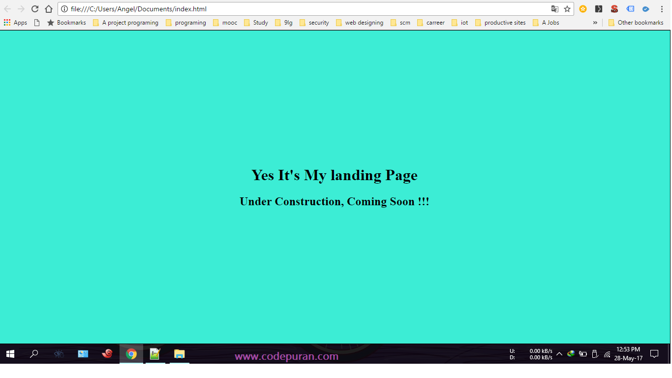
}<div class="centered-text">
<h1>Yes, it's my landing page</h1>
<h2>Under construction, coming soon!!!</h2>
</div>上述代码片段的输出如下:
0赞
antelove
9/22/2017
#29
.box {
  width: 100%;
  background: #000;
  font-size: 48px;
  color: #FFF;
  text-align: center;
}

.height {
  line-height: 170px;
  height: 170px;
}

.transform {
  height: 170px;
  position: relative;
}

.transform p {
  margin: 0;
  position: absolute;
  top: 50%;
  left: 50%;
  -ms-transform: translate(-50%, -50%);
  transform: translate(-50%, -50%);
}
<h4>Using Height</h4>
<div class="box height">
Lorem ipsum dolor sit
</div>
<hr />
<h4>Using Transform</h4>
<div class="box transform">
<p>Lorem ipsum dolor sit</p>
</div>
3赞
Rafiqul Islam
11/24/2017
#30
请尝试以下代码:
display: table-cell;
vertical-align: middle;
div {
  height: 80%;
  width: 100%;
  text-align: center;
  display: table-cell;
  vertical-align: middle;
  background: #4CAF50;
  color: #fff;
  font-size: 50px;
  font-style: italic;
}
<div>
Lorem Ipsum is simply dummy text of the printing and typesetting industry. Lorem Ipsum has been the industry's standard dummy text ever since the 1500s
</div>
4赞
Caner
1/2/2018
#31
以下代码会将 div 放在屏幕中间,而不管屏幕大小如何:div
.center-screen {
  display: flex;
  flex-direction: column;
  justify-content: center;
  align-items: center;
  text-align: center;
  min-height: 100vh;
}
<html>
<head>
</head>
<body>
<div class="center-screen">
I'm in the center
</div>
</body>
</html>在此处查看更多详细信息。flex
24赞
Saravana priyan S
2/28/2018
#32
我看到了之前的答案,它们仅适用于该宽度的屏幕(无响应)。对于响应式,您必须使用 flex。
例:
div { display:flex; align-items:center; }
5赞
Ram kumar
5/24/2018
#33
更好的主意。你也可以这样做
body,
html {
  height: 100%;
}

.parent {
  white-space: nowrap;
  height: 100%;
  text-align: center;
}

.parent:after {
  display: inline-block;
  vertical-align: middle;
  height: 100%;
  content: '';
}

.centered {
  display: inline-block;
  vertical-align: middle;
  white-space: normal;
}
<div class="parent">
<div class="centered">
<p>Lorem ipsum dolor sit amet.</p>
</div>
</div>
1赞
ArifMustafa
7/3/2018
#34
绝对定位和拉伸
与上述方法一样,首先将父元素和子元素的定位分别设置为相对和绝对。从那里开始,情况就不同了。
在下面的代码中,我再次使用此方法在水平和垂直方向上使子项居中,尽管您只能将该方法用于垂直居中。
[HTML全文]
<div id="parent">
    <div id="child">Content here</div>
</div>
CSS的
#parent {position: relative;}
#child {
    position: absolute;
    top: 0;
    bottom: 0;
    left: 0;
    right: 0;
    width: 50%;
    height: 30%;
    margin: auto;
}
此方法的想法是尝试通过将顶部、底部、右侧和左侧值设置为 0 来使子元素拉伸到所有四个边。由于子元素小于父元素,因此无法到达所有四条边。
但是,将 auto 设置为所有四个边的边距会导致相反的边距相等,并将子 div 显示在父 div 的中心。
不幸的是,上述方法不适用于 Internet Explorer 7 及更低版本,并且与之前的方法一样,子 div 中的内容可能会变得太大,从而导致它被隐藏。
0赞
MiMFa
8/20/2018
#35
这很简单,而且很短:
.block {
  display: table-row;
  vertical-align: middle;
}

.tile {
  display: table-cell;
  vertical-align: middle;
  text-align: center;
  width: 500px;
  height: 100px;
}
<div class="body">
<span class="tile">
Hello middle world! :)
</span>
</div>评论
0赞
Alex Riabov
8/20/2018
虽然此代码可以回答问题,但提供有关此代码为何和/或如何回答问题的其他上下文可以提高其长期价值。
2赞
Sivaprakash D
10/23/2018
#36
你可以在 CSS 中使用定位方法:
HTML格式:
<div class="relativediv">
  <p>
    Make me vertical align as center
  </p>
</div>
CSS:
.relativediv {
    position: relative;
    border: 1px solid #DDD;
    height: 300px;
    width: 300px
}
.relativediv p {
    position: absolute;
    top: 50%;
    transfrom: translateY(-50%);
}
评论
1赞
Peter Mortensen
12/9/2022
“absolute”附近似乎存在语法错误。
39赞
Long Tran
11/25/2018
#37
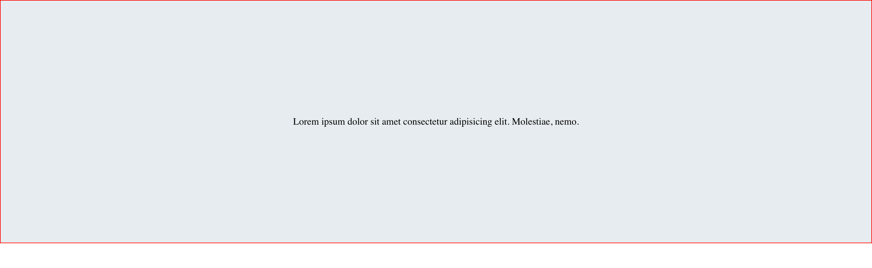
这是使用 Flexbox 的另一种选择。
#container {
  display: flex;
  height: 200px;
  background: orange;
}

.child {
  margin: auto;
}
<div id="container">
<div class="child">
<span>Lorem ipsum dolor sit amet consectetur adipisicing elit. Molestiae, nemo.</span>
</div>
</div>结果
这是一篇关于在CSS中居中的好文章。一探究竟。
评论