提问人:jbutler483 提问时间:5/18/2015 最后编辑:Communityjbutler483 更新时间:1/12/2021 访问量:36784
带箭头的对话气泡
Speech bubble with arrow
问:
我有一个项目,我需要插入对话气泡/消息框。我试图实现的一般形状是这样的:

.bubble {
  height: 100px;
  width: 200px;
  border: 3px solid gray;
  background: lightgray;
  position: relative;
  cursor:pointer;
}
.triangle {
  width: 0;
  border-top: 20px solid black;
  border-left: 20px solid transparent;
  border-right: 20px solid transparent;
  cursor:pointer;
}
<div class="bubble">Speech bubble
</div>
<div class="triangle">
</div>这目前没有通过命中测试,因为透明边框也是可点击的。
目标
点击框(可点击/可悬停区域)需要坚持形状的边界(此处的透明边框也是可悬停的,使其无效)。
我需要在各种内容(图像、渐变、文本......
问题
我在操作此形状时遇到的主要问题是:
- 能够根据它所指的元素的位置(上/左/右/下两侧)围绕对话气泡移动三角形
- 需要强调时在其周围添加边框或框阴影
有没有解决这些问题的方法?
答:
93赞
jbutler483
5/18/2015
#1
为了实现这一点,您应该考虑更改标记以使您的 html 更有效率。这可以使用伪元素来实现。我将分别解决每一点,并在我的答案末尾将它们放在一起。
首先
使用伪元素来避免额外的元素
您可以使用伪元素来删除多余的 div。这不仅减少了你的 div 编号,而且还有助于定位,因为你可以使用 和 css 属性来根据你的主要元素进行定位。这可以在下面看到:.triangletop:left:right:bottom:
.oneAndOnlyDiv {
  height: 100px;
  width: 200px;
  border: 3px solid gray;
  background: lightgray;
  position: relative;
}
.oneAndOnlyDiv:before {
  content: "";
  position: absolute;
  top: 100%;
  left: 20px;
  width: 0;
  border-top: 20px solid black;
  border-left: 20px solid transparent;
  border-right: 20px solid transparent;
}
<div class="oneAndOnlyDiv">Main div</div>命中测试
为了创建您的“命中测试”,您可能希望使用旋转元素而不是边框黑客。
像这样:
div {
  height: 100px;
  width: 200px;
  background: gray;
  position: relative;
  cursor:pointer;
}
div:before {
  content: "";
  position: absolute;
  top: 100%;
  left: 20px;
  height: 20px;
  width: 20px;
  background: black;
  transform: rotate(45deg);
  transform-origin:top right;
}
<div>Only element</div>或者使用倾斜的伪元素:
div {
  height: 100px;
  width: 200px;
  background: gray;
  position: relative;
  cursor:pointer;
}
div:before {
  content: "";
  position: absolute;
  top: 90%;
  left: 20px;
  height: 30%;
  width: 20px;
  background: black;
  transform: skewY(-45deg);
  transform-origin:bottom left;
  z-index:-1;
}
<div>Only element</div>仅当正方形或主元素悬停时才会显示指针。 但是等等,这搞砸了定位?你怎么能处理呢?
有几种解决方案。其中之一是使用 CSS 属性。calc
div {
  height: 100px;
  width: 200px;
  background: gray;
  position: relative;
  cursor:pointer;
}
div:before {
  content: "";
  position: absolute;
  top: -webkit-calc(100% - 10px); /*may require prefix for old browser support*/
  top: calc(100% - 10px); /*i.e. half the height*/
  left: 20px;
  height: 20px;
  width: 20px;
  background: gray;
  transform: rotate(45deg);
}
<div>Only element</div>添加边框
现在,您可以很容易地添加边框,只需向 main 元素添加边框声明,并将伪元素的 和 设置为border-bottomborder-rightinherit
边境
div {
  height: 100px;
  width: 200px;
  background: gray;
  position: relative;
  cursor:pointer;
  border:3px double black;
}
div:before {
  content: "";
  position: absolute;
  top: -webkit-calc(100% - 10px); /*may require prefix for old browser support*/
  top: calc(100% - 10px); /*i.e. half the height*/
  left: 20px;
  height: 20px;
  width: 20px;
  background: gray;
  transform: rotate(45deg);
  border-bottom:inherit;
  border-right:inherit;
  box-shadow:inherit;
}
<div>Only element</div>箱体阴影:
为了获得一个盒子阴影,我使用了伪元素,以便将盒子阴影隐藏在另一个伪元素上,使元素看起来像一个单一的元素。:after
div {
  height: 100px;
  width: 200px;
  background: gray;
  position: relative;
  cursor:pointer;
  box-shadow: 5px 5px 10px 2px black;
}
div:before,div:after {
  content: "";
  position: absolute;
  top: -webkit-calc(100% - 10px); /*may require prefix for old browser support*/
  top: calc(100% - 10px); /*i.e. half the height*/
  left: 20px;
  height: 20px;
  width: 20px;
  background: gray;
  transform: rotate(45deg);
z-index:-1;
  box-shadow:inherit;
}
div:after{
  box-shadow:none;
  z-index:8;
  }
<div>Only element</div>把它们放在一起
您还可以使用 border-radius 属性再次向消息框或对话气泡添加边框半径:
div {
  height: 100px;
  width: 200px;
  background: gray;
  position: relative;
  cursor:pointer;
  border:3px double black;
  border-radius:10px;
}
div:before {
  content: "";
  position: absolute;
  top: -webkit-calc(100% - 10px); /*may require prefix for old browser support*/
  top: calc(100% - 10px); /*i.e. half the height*/
  left: 20px;
  height: 20px;
  width: 20px;
  background: gray;
  transform: rotate(45deg);
  border-bottom:inherit;
  border-right:inherit;
  box-shadow:inherit;
}
<div>Only element</div>这甚至可以让您不仅创建一个三角形,而且可以创建一个圆形呢?
div {
  height: 100px;
  width: 200px;
  background: gray;
  position: relative;
  cursor:pointer;
  border:3px double black;
  border-radius:10px;
}
div:before {
  content: "";
  position: absolute;
  top: -webkit-calc(100% - 13px); /*may require prefix for old browser support*/
  top: calc(100% - 13px); /*i.e. half the height + border*/
  left: 20px;
  height: 20px;
  width: 20px;
  background: gray;
  transform: rotate(45deg);
  border:3px double transparent;
  border-bottom:inherit;
  border-right:inherit;
  box-shadow:inherit;
  border-radius:50%;
}
<div>Only element</div>如果您遇到内容溢出并“隐藏”在这个伪元素后面的问题,并且您不担心有边框,您可以使用负 z 索引来解决这个问题。
不喜欢使用“幻数”?
如果您不喜欢使用计算值的想法,其中我答案中的定位当前正在使用(在工作时),您可能希望使用transform:translate(50%)
这将是一个更好的方法,因为:
- 您不需要知道边框的大小,也不需要知道宽度的一半
- 您将使消息框/气泡在其定位上更加动态,并支持进一步调整大小。
div {
  height: 100px;
  width: 200px;
  background: gray;
  position: relative;
  cursor: pointer;
  border: 3px double black;
  border-radius: 10px;
}
div:before {
  content: "";
  position: absolute;
  top: 100%;
  left: 30px;
  height: 20px;
  width: 20px;
  background: gray;
  box-sizing:border-box;
  transform: rotate(45deg) translate(-50%);
  border-bottom: inherit;
  border-right: inherit;
  box-shadow: inherit;
}
<div>Only element</div>想移动它吗?您可以!
div {
  height: 100px;
  width: 200px;
  background: gray;
  position: relative;
  cursor: pointer;
  border: 3px double black;
  border-radius: 10px;
}
div:before {
  content: "";
  position: absolute;
  top: 100%;
  left: 10%;
  height: 20px;
  width: 20px;
  background: gray;
  box-sizing: border-box;
  transform: rotate(45deg) translate(-50%);
  border-bottom: inherit;
  border-right: inherit;
  box-shadow: inherit;
  transition: all 0.8s;
}
div:hover:before {
  left: 90%;
}
<div>Only element</div>想要一个正确的吗?
div {
  height: 100px;
  width: 200px;
  background: gray;
  position: relative;
  cursor: pointer;
  border: 3px double black;
  border-radius: 10px;
}
div:before {
  content: "";
  position: absolute;
  top: 15%;
  left: 100%;
  height: 20px;
  width: 20px;
  background: gray;
  box-sizing:border-box;
  transform: rotate(45deg) translate(-50%);
  border-top: inherit;
  border-right: inherit;
  box-shadow: inherit;
  transition:all 0.8s;
}
div:hover:before{
  top:80%;
  }
<div>Only Element</div>想要它成为不同形状的三角形吗?
div {
  height: 100px;
  width: 200px;
  background: gray;
  position: relative;
  cursor: pointer;
  border-radius: 10px;
}
div:before {
  content: "";
  position: absolute;
  top: 70%;
  left: 100%;
  height: 20px;
  width: 20px;
  background: gray;
  box-sizing:border-box;
  transform:  translate(-50%) skewX(45deg);
  box-shadow: inherit;
  transition:all 0.8s;
  z-index:-1;
}
div:hover:before{
  transform:  translate(-50%);
  border-radius:50%;
  top:20%;
  }
<div>Only Element</div>评论
4赞
Paulie_D
5/18/2015
非常详细的答案。
0赞
jbutler483
5/18/2015
干杯 @Paulie_D:只是认为有一个“详细”答案的空间,可以解决大多数问题:)
0赞
Paulie_D
5/18/2015
我唯一的评论是位置计算值。你能不能用一个代替,那么它适用于所有尺寸......不需要幻数?transform:translate(50%)
0赞
jbutler483
5/18/2015
@Paulie_D:你是个天才(忘了......再次)哈哈。编辑
4赞
Persijn
5/18/2015
#2
SVG
这不会通过命中测试,因为透明边框也是可点击的
这可以使用 svg 中的指针事件来完成。
只会选择有油漆的部分。pointer-events:visibleFill;
此示例使用 filter_box-shadow,IE 不支持。
还使用两种形状。
html,
body {
  margin: 0;
  padding: 0;
}
.bubble {
  width: 150px;
  height: 150px;
  -webkit-filter: drop-shadow(5px 5px 0px #aaa);
  filter: drop-shadow(5px 5px 0px #aaa);
}
.bubble-shape {
  fill: #1e1;
}
.shape-text {
  color: black;
}
<svg class="bubble" viewBox="0 0 110 110" xmlns="http://www.w3.org/2000/svg" preserveAspectRatio="none">
<g class="bubble-shape" style="cursor:pointer; pointer-events:visibleFill;">
<rect x="10" y="10" width="90" height="90" rx="15" ry="15" />
<polygon points="20,94 40,94 30,105" />
</g>
</svg>
此示例使用一个路径
IE 应完全支持。
html,
body {
  margin: 0;
  padding: 0;
}
.bubble {
  width: 150px;
  height: 150px;
}
.bubble-shape {
  stroke-width: 15;
  stroke: #ddd;
  fill: #1e1;
}
.shape-text {
  color: black;
}
<svg class="bubble" viewBox="-70 -10 390 370" xmlns="http://www.w3.org/2000/svg" preserveAspectRatio="none">
<g style="cursor:pointer; pointer-events:visible;">
<path class="bubble-shape" d="m 0,0 250,0 c 25,0 50,20 50,50 l 0,225 c 0,25 -25,50 -50,50 l -175,0 -25,20 -20,-20 -40,0 c -25,0 -50,-25 -50,-50 l 0,-225 C -50,25 -50,0 0,0 Z" />
</g>
</svg>
20赞
Temani Afif
1/12/2021
#3
我们可以依靠 和 drop-shadow filter 来轻松实现这一点:clip-path
.box {
  margin: 50px;
  width: 200px;
  height: 100px;
  border-radius: 15px;
  background: red;
  position: relative;
  filter:  /* the more shadow you add the thicker the border will be */
    drop-shadow(0px 0px 1px green)
    drop-shadow(0px 0px 1px green)
    drop-shadow(0px 0px 1px green)
    drop-shadow(0px 0px 1px green)
    drop-shadow(0px 0px 1px green)
    drop-shadow(0px 0px 1px green);
}

.box::before {
  content: "";
  position: absolute;
  top: 100%;
  left: 20%;
  height: 30px;
  width: 50px;
  background: inherit;
  clip-path: polygon(0 0, 100% 0, 50% 100%);
}

.box:hover {
  background:blue;
}

body {
  background:linear-gradient(to right, pink,grey);
}
<div class="box"></div>我们可以扩展这个基本示例来考虑任何类型的位置和三角形形状:
.box {
  margin: 30px;
  width: 150px;
  height: 80px;
  display:inline-block;
  border-radius: 15px;
  background: red;
  position: relative;
  filter:  /* the more shadow you add the thicker the border will be */
    drop-shadow(0px 0px 1px green)
    drop-shadow(0px 0px 1px green)
    drop-shadow(0px 0px 1px green)
    drop-shadow(0px 0px 1px green)
    drop-shadow(0px 0px 1px green)
    drop-shadow(0px 0px 1px green);
}

.box::before {
  content: "";
  position: absolute;
  height: var(--h,20px);
  width: var(--w,30px);
  background: inherit;
  transform:scale(var(--x,1),var(--y,1));
}

.box.p-bottom::before{
  top: 100%;
  clip-path: polygon(0 0, 100% 0, 50% 100%);
}
.box.p-bottom.alt::before{
  clip-path: polygon(0 0, 100% 0, 100% 100%);
}
.box.p-top::before{
  bottom: 100%;
  clip-path: polygon(0 100%, 100% 100%, 50% 0);
}
.box.p-top.alt::before{
  clip-path: polygon(0 100%, 100% 100%, 100% 0);
}
.box.p-left::before{
  right: 100%;
  clip-path: polygon(100% 0, 100% 100%,0% 50%);
}
.box.p-left.alt::before{
  clip-path: polygon(100% 0, 100% 100%,0% 100%);
}
.box.p-right::before{
  left: 100%;
  clip-path: polygon(0% 0, 0% 100%,100% 50%);
}
.box.p-right.alt::before{
  clip-path: polygon(0% 0, 0% 100%,100% 100%);
}

.box.right::before{
  right:var(--p,20px);
}
.box.left::before {
  left:var(--p,20px);
}
.box.top::before{
  top:var(--p,20px);
}
.box.bottom::before {
  bottom:var(--p,20px);
}


.box:hover {
  background:blue;
}

body {
  background:linear-gradient(to right, pink,grey);
}
<div class="box p-bottom right"></div>
<div class="box p-bottom right alt"></div>
<div class="box p-bottom right alt" style="--x:-1"></div>
<div class="box p-top left"></div>
<div class="box p-top right" style="--p:40%"></div>
<div class="box p-top right alt" style="--p:40%"></div>
<div class="box p-left top"></div>
<div class="box p-left top alt"></div>
<div class="box p-right bottom" style="--w:20px;"></div>
<div class="box p-right bottom" style="--p:30px;--w:20px;--h:30px"></div>
<div class="box p-right bottom alt" style="--p:30px;--w:20px;--h:30px"></div>
<div class="box p-right bottom alt" style="--p:30px;--w:20px;--h:30px;--y:-1"></div>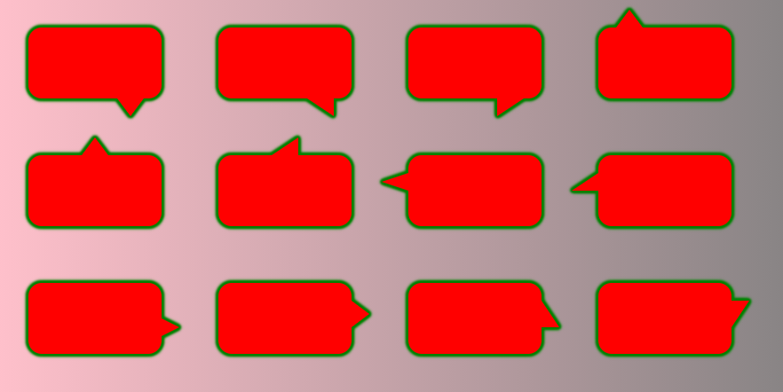
我们还可以考虑整个形状的任何类型的背景。这个技巧适用于固定的宽度/高度。这个想法是为主元素和伪元素创建一个具有相同大小的背景,然后我们只需调整伪元素内的背景位置以匹配父元素的位置(以达到完美的重叠)
.box {
  --h:20px;
  --w:30px;
  --p:20px;

  margin: 30px;
  width: 150px;
  height: 80px;
  display:inline-block;
  border-radius: 15px;
  background:
    var(--back,linear-gradient(45deg,red,purple))
    center/
    calc(150px + 2*var(--w)) calc(80px + 2*var(--h));
  position: relative;
  filter:  /* the more shadow you add the thicker the border will be */
    drop-shadow(0px 0px 1px green)
    drop-shadow(0px 0px 1px green)
    drop-shadow(0px 0px 1px green)
    drop-shadow(0px 0px 1px green)
    drop-shadow(0px 0px 1px green)
    drop-shadow(0px 0px 1px green);
}

.box::before {
  content: "";
  position: absolute;
  height: var(--h);
  width: var(--w);
  background: inherit;
  transform:scale(var(--x,1),var(--y,1));
  background-position:var(--b1) 0 var(--b2);
}

.box.p-bottom::before{
  top: 100%;
  clip-path: polygon(0 0, 100% 0, 50% 100%);
  --b1:bottom;
}
.box.p-bottom.alt::before{
  clip-path: polygon(0 0, 100% 0, 100% 100%);
}
.box.p-top::before{
  bottom: 100%;
  clip-path: polygon(0 100%, 100% 100%, 50% 0);
  --b1:top;
}
.box.p-top.alt::before{
  clip-path: polygon(0 100%, 100% 100%, 100% 0);
}
.box.p-left::before{
  right: 100%;
  clip-path: polygon(100% 0, 100% 100%,0% 50%);
  --b1:left;
}
.box.p-left.alt::before{
  clip-path: polygon(100% 0, 100% 100%,0% 100%);
}
.box.p-right::before{
  left: 100%;
  clip-path: polygon(0% 0, 0% 100%,100% 50%);
  --b1:right;
}
.box.p-right.alt::before{
  clip-path: polygon(0% 0, 0% 100%,100% 100%);
}

.box.right::before{
  right:var(--p);
  --b2:right calc(-1*var(--p) - var(--w));
}
.box.left::before {
  left:var(--p);
  --b2:left  calc(-1*var(--p) - var(--w));
}
.box.top::before{
  top:var(--p);
  --b2:top  calc(-1*var(--p) - var(--h));
}
.box.bottom::before {
  bottom:var(--p);
  --b2:bottom  calc(-1*var(--p) - var(--h));
}

body {
  background:linear-gradient(to right, pink,grey);
}
<div class="box p-bottom right"></div>
<div class="box p-bottom right alt" style="--back:url(https://picsum.photos/id/15/400/300)"></div>
<div class="box p-bottom right alt" style="--x:-1;--back:red"></div>
<div class="box p-top left" style="--back:url(https://picsum.photos/id/18/400/300)"></div>
<div class="box p-top right" style="--p:40px;--back:url(https://picsum.photos/id/1018/400/300)"></div>
<div class="box p-top right alt" style="--p:60px;--back:radial-gradient(red,pink,yellow)"></div>
<div class="box p-left top" style="--back:black"></div>
<div class="box p-left top alt" style="--back:repeating-linear-gradient(45deg,#fff 0 10px,orange 0 20px)"></div>
<div class="box p-right bottom" style="--w:20px;--back:linear-gradient(red,pink,yellow)"></div>
<div class="box p-right bottom" style="--p:30px;--w:20px;--h:30px;--back:repeating-radial-gradient(#fff 0 10px,orange 0 20px)"></div>
<div class="box p-right bottom alt" style="--p:30px;--w:20px;--h:30px;--back:conic-gradient(red,pink,yellow,red)"></div>
<div class="box p-right bottom alt" style="--p:30px;--w:20px;--h:30px;--y:-1;"></div>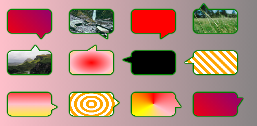
评论
5赞
jbutler483
2/2/2021
干杯 Temani。希望现在有了所有这些选项,我们将减少标签上的“HoW tO makE a SpeEch BubbLE”问题!css-shapes
评论