提问人:H3lltronik 提问时间:9/16/2019 最后编辑:azeósH3lltronik 更新时间:9/16/2019 访问量:901
具有不透明度和粒子的 CSS 点击动画
CSS click animation with opacity and particles
问:
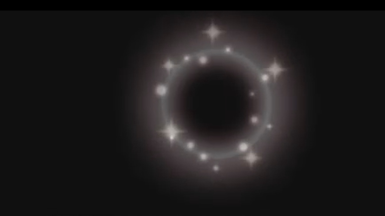
我想为我的网站制作一个自定义点击动画,我想做这样的事情: 这是从那个 gif
 中截取的 我的第一个 aproach 是这样的:
它有一些问题,例如,当我点击动画被触发时,动画跟随鼠标而不是停留在点击坐标中,它缺少很多东西,比如那些散布在点击区域的闪亮粒子和模糊的光晕,我不知道该怎么做,有人知道我应该怎么做才能做到这一点?比如,我应该学习或搜索什么才能得到我想要的东西?我缺乏专业知识,所以我真的想要一些小指导或任何东西
我不知道这是否有一点帮助,但我仍然会粘贴我第一种方法的代码
const cursor = document.querySelector('.cursor');

document.addEventListener('mousemove', e => {
  cursor.setAttribute("style", "top: " + (e.pageY - 10) + "px; left: " + (e.pageX - 10) + "px;");
})

document.addEventListener('click', () => {
  cursor.classList.add("expand");

  setTimeout(() => {
    cursor.classList.remove("expand");
  }, 500);
})
body {
margin: 0;
height: 100vh;
background-color: black;
}
.cursor {
width: 20px;
height: 20px;
border-radius: 50%;
position: absolute;
}
@keyframes cursorAnim3 {
0% {
transform: scale(1);
}
50% {
transform: scale(1.5);
opacity: 0.5;
}
100% {
transform: scale(1);
opacity: 0;
}
}
.expand {
animation: cursorAnim3 .3s forwards;
border: 2px solid rgba(255, 255, 255, 0.7);
}<div class="cursor"></div>欢迎任何建议:c
答:
2赞
Rojo
9/16/2019
#1
我添加到您的代码中的是事件中的 if 语句。我不知道如何解释,我只是添加了它,它有效......希望这就是你想要的!:)PS:我还添加了,因为体型正在增加。它位于mousemoveoverflow-x: hiddenoverflow-y: hidden
body {

}
const cursor = document.querySelector('.cursor');

document.addEventListener('mousemove', e => {
  if (cursor.classList.length === 1) {
    cursor.setAttribute("style", "top: " + (e.pageY - 10) + "px; left: " + (e.pageX - 10) + "px;");
  }
})

document.addEventListener('click', () => {
  cursor.classList.add("expand");

  setTimeout(() => {
    cursor.classList.remove("expand");
  }, 500);
})
body {
margin: 0;
height: 100vh;
overflow-x: hidden;
overflow-y: hidden;
background-color: black;
}
.cursor {
width: 20px;
height: 20px;
border-radius: 50%;
position: absolute;
}
@keyframes cursorAnim3 {
0% {
transform: scale(1);
}
50% {
transform: scale(1.5);
opacity: 0.5;
}
100% {
transform: scale(1);
opacity: 0;
}
}
.expand {
animation: cursorAnim3 .3s forwards;
border: 2px solid rgba(255, 255, 255, 0.7);
}<div class="cursor"></div>评论
0赞
Rojo
9/16/2019
@H3lltronik 如果这有帮助,请接受这是正确的答案。谢谢!
评论